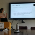
This week, the Lab hosted a two-part seminar. First, Gal Koss presented on best practices for data visualization, graphing, and plotting. Gal discussed Edward Tufte and seminal work The Visual Display of Quantitative Information, the Coolors palette generator tool, and how to avoid "chartjunk." Some data visualization resources from Gal are attached at the end of this post.